Winter plays such a large part in our lives here in Edmonton, and as designers, we have the challenge of finding effective and joyful ways to integrate this season! If you’re from Edmonton, you will know that we are given a lot of sunshine. During the day, we can maximize this natural resource by strategically placing windows so they can passively provide heat in buildings or by placing solar panels to harness the sun’s energy. We can equip outdoor areas with plenty of sunshade so people can enjoy this exceptional aspect of our city year-round. However, in our winter city, we also need to be mindful that the sun’s strong rays can cause glare when reflecting off of snow and ice. Therefore, while we want to maximize our exposure to the sun, we also need to avoid large areas where snow and ice can build up.
Thinking this way, we can find a good balance between necessity and enjoyment. Buildings with simpler shapes are more energy efficient as there are less complicated twists and turns, which can compromise how air tight a building can be. However, we can still make buildings interesting by using materials and colour to provide articulation and depth. Colour is a tool we can utilize not only to brighten up our buildings but also our surroundings during winter. A good play between a building’s exterior cladding and lighting can inject a sense of whimsy during those long periods of darkness.
As mentioned, outdoor areas where people can take advantage of our city’s sunshine is one strategy to help liven up those long winter months. To further entice people to brave the cold and take part in outdoor winter activities, we need to provide spaces that are both accessible and comfortable. For instance, outdoor spaces need to be large enough to accommodate various activities, but should still function well on a pedestrian scale so users don’t feel exposed to the elements. One way this balance between activity and comfort can be achieved is by designing surrounding buildings so that they are stepped back and a little irregular in shape. Buildings don’t have to take on overly complicated shapes, but providing some articulation can slow down and block the wind and even provide pockets of rest spaces with shade.
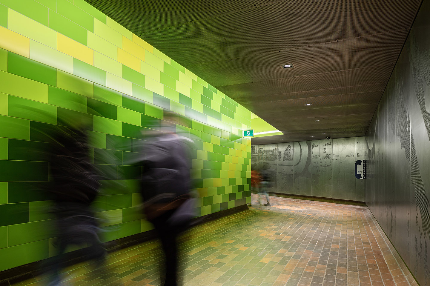
One of AVID’s projects is the renovation of the Cambridge Tunnel for the City of Edmonton. The tunnel connects the ATB Building, the Cambridge Building, and the Central LRT station. The renovated space is clad with perforated metal panels running the extent of one side of the tunnel. The graphic is a compilation of layered maps and images which document Jasper Avenue at different points in its urban history. The opposite side of the tunnel is a pattern made up of green and yellow tiles, inspired by the various shades of green that are visible when walking through the river valley while the sun filters through the leaves. The tunnel is a good winter amenity providing a covered and heated pathway for people to travel through on their way to their various destinations. This pairing of colour and texture help to liven up this space and provide visual interest as people walk through to seek shelter from the elements.


Another one of AVID’s projects is Norwood Medical. The design is conceived as a massive rocky outcropping intersected by walls of glass. Tones and forms employed in the facade are reminiscent of valley and slope, winter snow and mounded earth, and open skies. These elements pay homage to our winter roots and liven up our streetscape experience during those greyer months.
Designing to our local conditions and providing creative ways to address its limitations are goals we are passionate about. We feel that acknowledging our environment through reflective design is one way we can create sustainable cities that are healthy, lively, and unique. If you have any ideas or comments, feel free to drop us a line!
